
Method
INTAKE / CONCEPTING / ART DIRECTION / ILLUSTRATION
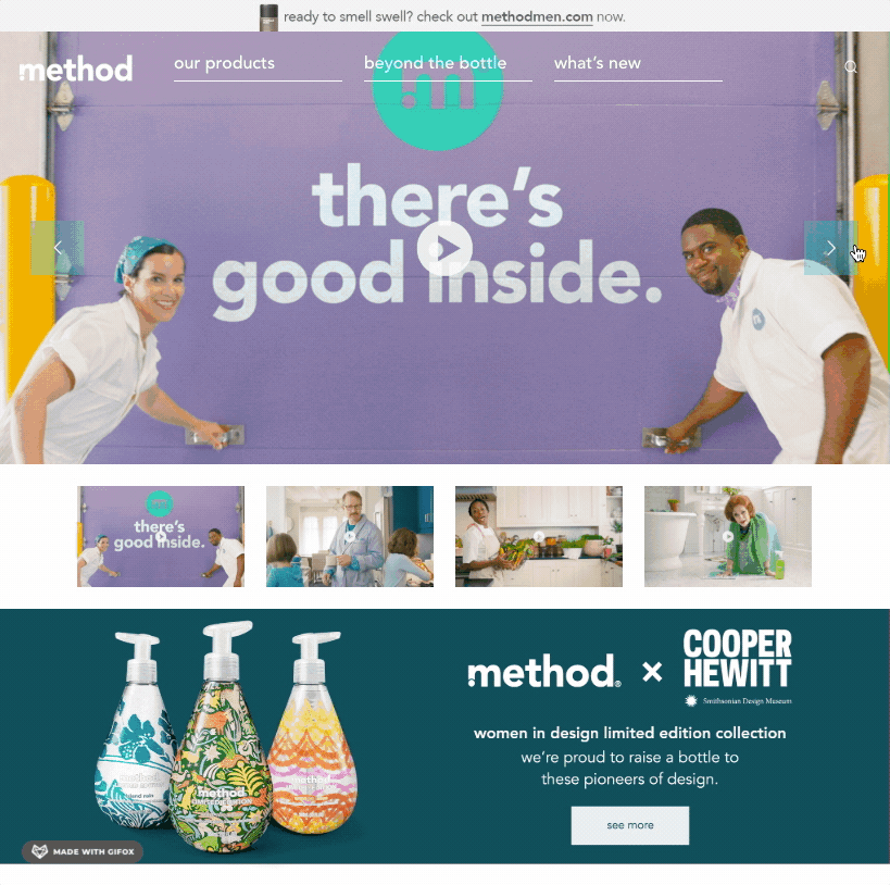
Our Director bumped into the CEO of Method in San Francisco. Our lead, Andrew Nevils, got us into pitch redoing the Method website. We showed our work and won the brand revamp.
Situation:
Method had a logo and color redesign. It needed to translate these changes into online brand guidelines.
Task:
The assignment was simple and complicated at the same time. Envision the new graphic into a style guide for the Method design team. The complicated part was threefold: 1. Be very organized to make finding products easy for the consumer, 2. Be outrageous in the layout and elements to reflect the company culture, and 3. Make the company look beautiful.
Action:
To address the ask needed a lot of research. The more we looked and experimented the more we understood that fashion magazines in many ways reflected the values of Method and of their primary demographic. We eventually aligned to an 80s aesthetic and mapped out the products, pages about company values, and how illustrations, icons, and type should look. Working closely with the Wordpress developer our keyframes and style guide passed all reviews.
Result:
Method was impressed with the high-design yet irreverent solution. The flexibility of the grid and illustration guidelines have influenced Method's style and culture. The site is still going strong years later.
 |  |  |
|---|---|---|
 |  |  |
 |